15 CRO Tips to Increase Conversion Rate for Small Businesses
Table of Contents
User Experience (UX)
- Simplify Navigation:
Easy navigation and user-friendly refer to the design and functionality of a website or application that make it simple and intuitive for users to find what they are looking for and perform desired actions.
Easy Navigation:
- Definition: The structure of the website allows users to easily move between pages and sections without confusion.
- Example: A well-organized menu that clearly categorizes products or services, a search bar for quick access, and consistent placement of navigation elements across all pages.
- Benefit: It helps users find the information they need quickly, reducing frustration and increasing the chances of them staying on the site and converting.
User-Friendly:
- Definition: The overall design and usability of the website or app are intuitive, meaning users can interact with it without a steep learning curve.
- Example: Clear buttons, readable fonts, accessible features (like mobile responsiveness), and minimizing the number of steps it takes to perform an action (like checking out).
- Benefit: A user-friendly experience keeps visitors engaged, lowers bounce rates, and improves satisfaction, making them more likely to convert or return.
In short, easy navigation ensures that users can move through a site without getting lost, while user-friendliness means the entire site or app is designed to make interactions as smooth and intuitive as possible.
- Reduce Page Load Time refers to optimizing the speed at which your website or application loads, ensuring that it displays content quickly when users access it. A fast-loading page provides a better user experience, reduces bounce rates, and can lead to higher conversions. Here’s why and how it’s essential:
Why Page Load Time Matters:
- User Experience:
- Slow pages frustrate users. Most users expect a webpage to load in under 3 seconds. If it takes longer, they are likely to leave.
- SEO Impact:
- Search engines like Google prioritize fast websites. A quicker load time can improve your ranking, leading to more traffic.
- Conversion Rates:
- Faster websites keep users engaged, increasing the likelihood they will take actions like making a purchase or signing up. Studies show that even a 1-second delay can cause a significant drop in conversion rates.
How to Reduce Page Load Time:
- Optimize Images:
- Compress images without losing quality. Use modern formats like WebP, and only load images that are visible (lazy loading).
- Minimize HTTP Requests:
- Reduce the number of elements (images, scripts, stylesheets) that load on the page. Fewer elements mean faster loading.
- Use Browser Caching:
- Enable caching so that returning visitors don’t have to reload all content. Cached versions are stored locally and load faster.
- Minify CSS, JavaScript, and HTML:
- Remove unnecessary spaces, comments, and characters in code files to reduce file sizes, speeding up load time.
- Use a Content Delivery Network (CDN):
- A CDN stores copies of your site on servers worldwide, ensuring that users download content from the nearest server, reducing latency.
- Enable Compression:
- Gzip or Brotli compression can reduce the size of your HTML, CSS, and JavaScript files, allowing faster delivery to the user’s browser.
- Reduce Redirects:
- Too many redirects create additional requests and increase load times. Try to minimize unnecessary redirects.
- Optimize Server Response Time:
- Upgrade your hosting plan, or optimize server settings to handle requests more efficiently.
By reducing page load time, you can create a smoother, faster experience for users, improving your chances of higher engagement and conversions.

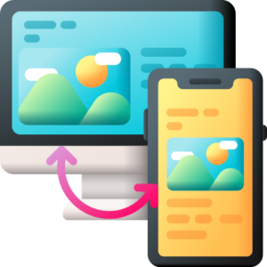
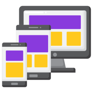
- Use Mobile-Responsive Design:
Use Mobile-Responsive Design means creating a website or application that automatically adjusts its layout, content, and features to look and function properly on different devices, especially smartphones and tablets. Mobile-responsive design ensures that users have a seamless and optimized experience, whether they are browsing on a desktop, tablet, or mobile phone.
Why Mobile-Responsive Design Matters:
-
- Mobile Traffic Dominance:
- A large percentage of web traffic now comes from mobile devices. If your site isn’t mobile-friendly, you risk losing potential customers who primarily use mobile devices to browse.
- Improved User Experience:
- A responsive site makes it easy for users to navigate, read, and interact with the content on any device. This enhances their experience and keeps them engaged longer.
- Better SEO (Search Engine Optimization):
- Search engines like Google prioritize mobile-friendly websites in their rankings. A mobile-responsive design can help boost your site’s visibility in search results, driving more traffic.
- Increased Conversion Rates:
- Mobile users are more likely to convert if they can easily browse, shop, or fill out forms without zooming in or dealing with poor navigation on a small screen.
- Mobile Traffic Dominance:
-
How to Implement Mobile-Responsive Design:
- Fluid Grids:
- Use a flexible grid system that scales according to the screen size. This ensures that content and elements resize proportionally on different devices.
- Flexible Images and Media:
- Ensure images and media adapt to various screen sizes. Use CSS to scale images proportionally and implement responsive video embedding techniques.
- Touch-Friendly Elements:
- Design buttons, menus, and interactive elements to be easy to use on touchscreens. Make sure buttons are large enough to tap, and avoid hover-based actions, which don’t work well on touch devices.
- Viewport Meta Tag:
- Set the viewport meta tag in HTML to control how your website appears on different devices, making sure it fits within the screen’s width.
- CSS Media Queries:
- Use media queries to apply different CSS styles depending on the screen width, ensuring the layout adapts to mobile, tablet, or desktop sizes.
- Responsive Navigation:
- Simplify navigation menus for smaller screens. Use collapsible menus (hamburger menus) or dropdowns to ensure users can easily navigate on mobile.
- Optimize for Touch Inputs:
- Design for touch interactions by making clickable areas larger and avoiding elements that are too close together, reducing user frustration.
- Test on Multiple Devices:
- Continuously test your site on various mobile devices and browsers to ensure consistent performance across different screen sizes and platforms.
Benefits of Mobile-Responsive Design:
- Enhanced Accessibility: Users can access your site easily on any device, without limitations.
- Higher Engagement: A better user experience leads to lower bounce rates and more time spent on the site.
- Increased Conversions: If your mobile visitors can easily navigate and interact with your content, they are more likely to convert.
- Future-Proofing: Responsive design ensures that your website adapts to future devices with varying screen sizes.
In summary, mobile-responsive design is crucial for capturing the growing mobile audience, improving user experience, and boosting SEO and conversions.
- Remove Distractions:
Why Removing Distractions Matters:
- Focus on the Goal:
The main objective of any webpage is to guide visitors toward a specific action, such as making a purchase, signing up, or downloading something. When there are too many distracting elements, users may get confused or overwhelmed, reducing the chances that they’ll complete that action. - Improved User Experience:
When a webpage is clean and uncluttered, it becomes easier for users to navigate. Reducing unnecessary elements decreases the mental effort required to process information, making users feel more at ease and increasing the likelihood that they will engage further. - Higher Conversions:
By removing distractions, you allow users to focus on the most important elements, such as calls-to-action. This often results in higher conversion rates because visitors aren’t being pulled away by unrelated or unnecessary features.
How to Remove Distractions:
- Limit Pop-ups:
While pop-ups can sometimes be useful, too many of them or poorly timed pop-ups can be annoying. For example, a pop-up that appears immediately when someone arrives on your site can cause frustration, potentially driving visitors away before they even engage with the content. - Minimize Advertisements:
Ads can be highly distracting, especially if they are intrusive, flashy, or take up too much space. While ads can be a source of revenue, placing too many on a page can interfere with the user’s journey and reduce the chance of them taking meaningful action. - Stick to a Simple Design:
Overloading your webpage with too many colors, fonts, or visual elements can make it appear chaotic. A simple design with a consistent color scheme and limited font choices allows users to focus on what’s most important without being distracted by unnecessary details. - Reduce Page Clutter:
Keep the amount of content on each page manageable. Avoid filling every available space with text, images, or videos. A clean, organized layout helps users absorb information more easily and directs their attention to the most relevant areas of the page. - Simplify Navigation:
An overly complex navigation menu can confuse users. Providing clear, simple menu options helps visitors find what they’re looking for without getting lost or overwhelmed by too many choices. - Limit External Links:
While linking to external sites can sometimes be helpful, overdoing it may cause users to leave your page, reducing the likelihood of them completing a desired action. Try to keep users focused on the content or action on your page instead of leading them elsewhere. - Focus on One Main Call-to-Action:
Each page should guide visitors to a single, clear call-to-action, such as “Buy Now” or “Sign Up.” Having too many competing actions can confuse users and make them unsure of what to do next. Keeping the focus on one main action makes it more likely that visitors will follow through. - Create a Visual Hierarchy:
Design your page so that the most important elements, like your call-to-action, stand out. This can be achieved by making key elements larger or more visually distinct, so users are naturally drawn to them without distraction from less important details. - Avoid Auto-Play Content:
Automatically playing videos or audio can be jarring for visitors, especially if they weren’t expecting it. This can disrupt their experience and may even cause them to leave the page immediately. Allow users to choose when and whether to play media. - Streamline Sidebars:
Sidebars often contain a lot of extra content, such as widgets, ads, or links to other pages, which can clutter the user’s view. Consider removing or simplifying sidebars to ensure that visitors stay focused on the main content of the page.
Benefits of Removing Distractions:
- Increased Focus:
When distractions are removed, users can concentrate more easily on the main purpose of the page, whether it’s making a purchase, signing up for a service, or learning more about a product. - Higher Engagement:
A distraction-free page encourages users to stay longer and engage with the content. They’re more likely to continue exploring the site or take the desired action. - Better Conversion Rates:
By guiding users’ attention to a single goal and eliminating unnecessary elements, you can significantly improve your chances of converting visitors into customers or leads.
In conclusion, removing distractions is about simplifying the design and content of your webpage to make it easier for users to focus on the most important actions. This creates a better experience and increases the likelihood of achieving your business goals.
- Use White Space Effectively:
Using white space effectively refers to the intentional use of empty or blank spaces around elements on a webpage, such as text, images, buttons, and other content. White space, also known as “negative space,” helps to create a clean, uncluttered design that improves readability, user experience, and visual appeal, ultimately boosting engagement and conversion rates.
Why Using White Space Effectively Matters:
- Improves Readability:
White space makes text easier to read and digest by providing breathing room around paragraphs, headings, and images. When the content is spaced out, users can scan and absorb the information more comfortably without feeling overwhelmed. - Enhances Focus:
The strategic use of white space draws attention to specific elements, such as a call-to-action button or an important headline. It helps to guide the user’s eye naturally to where you want them to focus, such as a sign-up form or a product feature. - Creates a Clean, Professional Design:
A layout with adequate white space looks modern and professional. Overcrowded designs with too many elements crammed together can feel chaotic and unappealing, but white space adds balance and elegance to the overall design. - Reduces Cognitive Load:
White space helps to simplify complex information by breaking it down into smaller, more manageable sections. This reduces the amount of mental effort users need to understand and navigate the site, making their experience more enjoyable. - Increases Conversion Rates:
By using white space around calls to action or key information, you make it easier for users to take the desired action. A well-placed button with plenty of space around it stands out and encourages interaction.
How to Use White Space Effectively:
- Around Text:
Add ample spacing between lines of text (line height) and between paragraphs to make the content easier to read. Avoid cramming text together, as it can feel overwhelming and cause visitors to leave without engaging. - Between Elements:
Ensure there is enough space between different elements, such as images, buttons, and blocks of text. This separation makes each element stand out and avoids a cluttered design that might confuse users. - In Headers and Footers:
Don’t overcrowd the header and footer areas of your website. Keep them clean and minimal, with plenty of space around the navigation menus and logos, so users can easily focus on the most important links and information. - Around CTAs (Call-to-Actions):
Surround your primary call-to-action button with plenty of white space. This draws attention to the button and makes it stand out, increasing the likelihood that users will click and take the desired action. - On Landing Pages:
Landing pages benefit from simplicity and focus. By using white space generously, you can create a clean, distraction-free environment that encourages visitors to focus on your offer and CTA. - In Mobile Design:
White space is especially important in mobile-responsive design, where screen space is limited. Ensuring that there is enough white space between buttons, text, and other elements improves usability and prevents users from accidentally tapping the wrong link. - Around Images:
Allow your images to breathe by providing space around them. When images are crowded with text or other visual elements, they can lose their impact. White space makes them stand out and creates a more balanced, appealing design. - Use of Margins and Padding:
Set consistent margins and padding around elements to maintain a uniform look throughout the site. This consistency in spacing creates a harmonious flow and ensures the design feels cohesive rather than disjointed.
Benefits of Using White Space Effectively:
- Better User Experience:
Visitors are more likely to stay on your site and engage with the content if the design is clean and easy to navigate. White space makes the browsing experience more enjoyable by reducing clutter and improving clarity. - Increased Engagement:
Well-placed white space encourages users to focus on the most important elements, such as product features or a call to action, leading to higher levels of engagement. - Higher Conversions:
White space around conversion elements, like buttons or forms, makes them more noticeable and clickable. This can lead to improved conversion rates, whether it’s for sign-ups, purchases, or inquiries. - More Modern Design:
Minimalistic designs that incorporate plenty of white space tend to look modern and professional. This can enhance the overall perception of your brand and instill confidence in visitors.
In summary, using white space effectively creates a clean, intuitive, and visually appealing website that enhances the user experience, increases focus on key elements, and ultimately drives higher engagement and conversion rates. It’s a powerful tool in web design that enhances readability, navigation, and overall user satisfaction.
- Highlight Calls-to-Action (CTAs):
Highlighting Calls-to-Action (CTAs) means making the key action buttons or links on your website or app stand out visually so that users are naturally drawn to them. CTAs are critical elements of your site because they prompt users to take specific actions like making a purchase, signing up for a newsletter, or downloading a resource. Properly highlighting CTAs can significantly boost conversions and user engagement.
Why Highlighting CTAs Matters:
- Drives Conversions:
CTAs are the focal point of conversion actions. Whether you want users to buy a product, sign up, or contact you, a clear, eye-catching CTA makes it easier for them to take the next step. - Improves User Experience:
Well-highlighted CTAs guide users through the site, helping them navigate smoothly and easily find the next step. This creates a better, more intuitive user journey. - Reduces Confusion:
Without a clearly visible CTA, users might get lost or unsure of what to do next. Highlighting the CTA makes their path clear, reducing frustration and increasing engagement.
How to Highlight CTAs Effectively:
- Use Contrasting Colors:
The CTA should stand out visually from the rest of the page. Use a color that contrasts with the background and other elements to make it pop. For example, if your page is mostly blue, using a bright color like orange or green for your CTA can make it instantly noticeable. - Increase Button Size:
Larger buttons naturally draw more attention. Make sure your CTA is large enough to be easily visible and clickable, without overwhelming the design. The size should reflect its importance on the page. - Use Clear, Actionable Text:
The text on your CTA should clearly communicate what will happen when a user clicks it. Instead of vague terms like “Submit,” use action-oriented text such as “Get Started,” “Buy Now,” “Sign Up Free,” or “Download Here.” Clear messaging combined with the visual highlight improves engagement. - Place CTAs Prominently:
Place the CTA in a highly visible area of your page, like above the fold (the area visible without scrolling). If necessary, repeat the CTA in multiple locations, such as at the top and bottom of a long landing page, to capture users’ attention at different points of the journey. - Use White Space Around CTAs:
Give the CTA enough breathing room by surrounding it with plenty of white space. This helps isolate the button from other distractions and ensures it doesn’t blend in with the rest of the content. - Apply Visual Hierarchy:
Use design elements such as bold fonts, larger button sizes, and prominent placement to make the CTA the most noticeable element on the page. Visual hierarchy ensures users’ eyes are naturally drawn to the CTA as they scan the page. - Add Hover Effects:
Adding a subtle hover effect (such as changing the color or slightly enlarging the button when hovered over) can create a sense of interactivity and encourage users to click the CTA. This dynamic change reinforces the importance of the button and draws attention. - Use Urgency or Scarcity:
Incorporate urgency in the CTA text, such as “Limited Offer,” “Get It Now,” or “Only X Left.” Highlighting urgency with a CTA makes users more likely to act quickly rather than delaying their decision. - Ensure Mobile-Friendliness:
On mobile devices, ensure that your CTA buttons are large enough to tap easily, and are prominently placed. Avoid small buttons or links that are hard to interact with on smaller screens. - Consistent CTA Placement:
Keep CTA placement consistent across your site. For example, if your CTA buttons are usually at the bottom of the page, avoid placing them in random areas on different pages. This consistency helps users know where to look when they’re ready to take action.
Benefits of Highlighting CTAs:
- Increased Conversions:
A clearly visible and engaging CTA improves the chances of users taking the action you want, whether it’s making a purchase, subscribing, or registering for an event. - Improved Engagement:
Users are more likely to interact with a site that guides them smoothly through their journey with prominent, easy-to-spot CTAs. This creates a better user experience and encourages repeat visits. - Clear User Journey:
Highlighting CTAs helps users understand the next step they need to take, preventing confusion and ensuring they move through the sales funnel seamlessly. - Faster Decision Making:
A well-highlighted CTA with compelling messaging can shorten the decision-making process by making the action feel more accessible and urgent.
In summary, highlighting CTAs involves using design strategies that make your calls-to-action visually appealing and easy to interact with. By ensuring they stand out with the right colors, size, placement, and messaging, you improve user experience and increase the likelihood of conversions.
- Use Action-Oriented CTAs:
Using action-oriented CTAs refers to crafting your call-to-action buttons or links with language that encourages immediate and specific actions from users. Instead of vague or passive phrases, action-oriented CTAs tell users exactly what they will gain by clicking the button, and they create a sense of urgency or motivation to act. These types of CTAs are crucial for driving higher engagement and conversion rates because they make the next step clear and compelling.
Why Action-Oriented CTAs Matter:
- Encourages User Engagement:
Action-oriented CTAs use verbs that prompt users to take immediate action. They are more effective because they make users feel like they are doing something active, whether it’s buying, signing up, downloading, or learning more. - Clarifies the Next Step:
By using precise language, these CTAs leave no room for confusion. The user knows exactly what will happen when they click the button, which reduces hesitation and boosts confidence in taking the next step. - Creates a Sense of Urgency:
Words like “now,” “today,” or “get started” convey a sense of immediacy, encouraging users to act quickly instead of procrastinating. This sense of urgency helps improve conversion rates. - Appeals to User Intent:
Action-oriented CTAs align with the user’s intent. For example, if a user is on a product page, they likely want to buy, so a CTA like “Buy Now” resonates more effectively than something generic like “Submit.”
How to Use Action-Oriented CTAs Effectively:
- Be Clear and Direct:
The CTA should use clear, specific language that tells the user exactly what to do. For example, instead of using “Submit,” which is generic and passive, use action-driven language like “Sign Up for Free” or “Download the Guide.” - Focus on Benefits:
Combine the action with a benefit to the user. For example, instead of just “Get Started,” you could say “Get Started with a Free Trial.” This shows the user not only what action to take but also what they’ll gain from it. - Use Strong, Active Verbs:
Always use powerful action words to drive the point home. Examples of strong verbs include:- Buy
- Start
- Get
- Download
- Join
- Discover
- Learn
These words motivate users to engage with your CTA because they feel like they’re actively doing something.
- Create Urgency:
Use time-sensitive language like “Shop Now,” “Get Instant Access,” or “Claim Your Spot.” This kind of CTA prompts users to act immediately rather than waiting, which can help increase conversions. - Incorporate Personalization:
Make the CTA feel more personal by speaking directly to the user. For example, instead of “Start Free Trial,” say “Start Your Free Trial Today.” Personalizing the CTA makes users feel like the message is tailored specifically to them. - Keep it Short and Sweet:
Your CTA should be concise and to the point. Ideally, it should be no more than 2–4 words, as longer phrases can overwhelm or confuse users. Short, action-packed phrases like “Sign Up Now” or “Download Free Guide” are far more effective. - Match CTA to the User Journey:
Use CTAs that match the stage of the user’s journey. For example, a first-time visitor may respond better to “Learn More” or “Explore Features,” while a returning customer may be ready for “Buy Now” or “Upgrade Your Plan.” - Add Emotional Appeal:
Try to tap into users’ emotions by including motivating words. For instance, instead of “Sign Up,” you could use “Join Thousands of Happy Customers” or “Start Your Dream Project Today.” This evokes an emotional connection, making the CTA more compelling. - Use Numbers When Applicable:
If your CTA offers a specific, tangible benefit, highlight that in the button. For example, “Save 20% Now” or “Get 2 Weeks Free” gives users an immediate sense of the value they will receive, making it more likely they’ll act. - Test Different CTAs:
Always A/B test your CTAs to see which wording drives the most engagement. Try variations like “Sign Up Today” vs. “Get Your Free Account” to learn which action phrases resonate best with your audience.
Examples of Action-Oriented CTAs:
- For eCommerce:
- “Shop Now”
- “Add to Cart”
- “Grab Your Deal”
- For SaaS or Services:
- “Start Your Free Trial”
- “Get Instant Access”
- “Sign Up in 30 Seconds”
- For Content and Downloads:
- “Download the Free Guide”
- “Get the Ebook”
- “Watch the Video Now”
- For Events or Offers:
- “Claim Your Spot”
- “Reserve Your Seat”
- “Register for Free”
Benefits of Using Action-Oriented CTAs:
- Higher Conversions:
By using direct, compelling language, action-oriented CTAs increase the likelihood that users will take the next step, leading to higher conversion rates for sign-ups, purchases, or other goals. - Improved User Engagement:
Action-oriented CTAs are specific and motivating, encouraging users to interact more with your site or app. When users know what to expect, they are more likely to engage with your content. - Faster Decision-Making:
Clear, actionable CTAs eliminate hesitation and simplify decision-making for users. They don’t have to wonder what to do next, which speeds up their journey from interest to action. - Better User Experience:
When users encounter well-written, actionable CTAs, their experience is more intuitive and satisfying. They know what steps to take and what they’ll get out of it, which creates a smoother, more enjoyable interaction with your brand.
In summary, using action-oriented CTAs means crafting compelling, direct, and motivating calls to action that guide users to take the desired step. By using strong verbs, creating urgency, and focusing on the benefits, you can significantly boost engagement, improve user experience, and drive conversions on your website or app.
- Use Testimonials & Reviews:
Using testimonials and reviews involves showcasing feedback and experiences from customers to build credibility, trust, and social proof for your products or services. Testimonials and reviews serve as powerful marketing tools that can influence potential customers’ decisions, demonstrating the value and quality of what you offer. When effectively displayed on your website or marketing materials, they can significantly enhance your conversion rates.
Why Testimonials & Reviews Matter:
- Builds Trust:
Potential customers are more likely to trust the opinions of their peers over direct marketing messages. Authentic testimonials can help establish your business as reputable and trustworthy. - Provides Social Proof:
When potential customers see that others have had positive experiences with your products or services, it creates a sense of confidence and security. Social proof can greatly influence purchasing decisions. - Reduces Perceived Risk:
Testimonials address common concerns and objections that potential buyers may have. Positive feedback can alleviate fears about product quality or service reliability, making customers more willing to commit. - Enhances SEO:
User-generated content, such as reviews, can improve your website’s search engine optimization (SEO) by providing fresh, relevant content that may include keywords related to your products or services.
How to Use Testimonials & Reviews Effectively:
- Choose Authentic and Relevant Testimonials:
Select testimonials that highlight specific benefits and positive experiences. Authentic feedback that addresses common pain points or showcases unique features of your product can resonate more with potential customers. - Use Real Names and Photos:
Whenever possible, include the names, photos, and even locations of the customers providing testimonials. This adds credibility and authenticity, making the feedback feel more genuine. - Incorporate Different Formats:
Use a variety of formats for testimonials, such as written quotes, video testimonials, or case studies. Different formats can appeal to various types of users and enhance engagement. - Highlight Key Points:
Emphasize specific phrases or key benefits within testimonials that directly address potential customer’s pain points. This makes it easier for visitors to quickly grasp the value you provide. - Create a Dedicated Testimonials Page:
If you have numerous testimonials, consider creating a dedicated page on your website to showcase them. This makes it easy for potential customers to find and read about others’ experiences with your products or services. - Display Reviews on Product Pages:
For eCommerce sites, displaying customer reviews directly on product pages can help potential buyers make informed decisions. This can lead to higher conversion rates as they see firsthand how others have benefited. - Use Star Ratings and Aggregated Scores:
Implement a rating system where users can see average scores for products or services. Star ratings visually convey the overall satisfaction level of customers and can influence purchasing decisions. - Incorporate Testimonials in Marketing Materials:
Use testimonials in various marketing channels, including social media, email campaigns, and print materials. This reinforces positive messages and extends the reach of social proof. - Encourage Customers to Leave Reviews:
After a purchase or service completion, follow up with customers and encourage them to leave feedback. Make the process easy by providing links or instructions on how to submit reviews. - Monitor and Respond to Reviews:
Actively monitor customer reviews on your website and third-party platforms. Responding to both positive and negative feedback demonstrates that you value customer opinions and are committed to improving their experience.
Benefits of Using Testimonials & Reviews:
- Increased Credibility:
Positive testimonials enhance your brand’s credibility, making potential customers more likely to trust and choose your business over competitors. - Higher Conversion Rates:
Testimonials and reviews can directly impact conversion rates by influencing purchasing decisions. When potential customers see evidence of satisfaction from others, they are more likely to complete a purchase. - Improved Customer Relationships:
Engaging with customers who leave reviews fosters a sense of community and loyalty. Customers who feel valued are more likely to return and recommend your business to others. - Stronger Marketing Messages:
Testimonials provide powerful content that can enhance your marketing messages. They allow you to tell stories of success and satisfaction that resonate with potential customers.
In summary, using testimonials and reviews effectively leverages customer feedback to build trust, provide social proof, and influence purchasing decisions. By showcasing authentic experiences and encouraging customers to share their opinions, you can enhance your brand’s credibility and drive higher conversion rates.